Make any chart responsive with one function

Developing for the modern web means accommodating the infinite screen sizes that now populate the world and there are almost as many strategies for dealing with those screen size variations. Responsive content that resizes and/or reflows in response to the available space is one of the core approaches, and luckily for us it's easy to apply to D3 charts.
Since most D3 pieces are created using SVG, they are inherently well suited for scaling. I mean, it's right there in the name: scalable vector graphics.
One function to scale them all
While not the only way to create a responsive D3 chart, the utility function below has served me well for quite some time now. Originally written by Brendan Sudol, let's take a look at the function itself, and then we'll see how to use it. I've included some extra inline comments to explain what's happening in the code.
{ // container will be the DOM element // that the svg is appended to // we then measure the container // and find its aspect ratio const container = d3 width = height = aspect = width / height; // set viewBox attribute to the initial size // control scaling with preserveAspectRatio // resize svg on inital page load svg ; // add a listener so the chart will be resized // when the window resizes // multiple listeners for the same event type // requires a namespace, i.e., 'click.foo' // api docs: https://goo.gl/F3ZCFr d3; // this is the code that resizes the chart // it will be called on load // and in response to window resizes // gets the width of the container // and resizes the svg to fill it // while maintaining a consistent aspect ratio { const w = ; svg; svg; }}Not too bad, right? Measure the chart's parent container and then resize the chart as needed to fill the space while maintaining the correct aspect ratio. But what's that viewBox attribute all about? Before we go into that let's see how to use this function. That way we keep the "just show me how to do cool stuff" crowd happy. 😆
When creating the SVG element your chart will live in, you just tack a call to responsivefy on at the end.
d3 ; // tada!No really, that's it! That will call the function and pass the SVG selection to it, and then responsivefy handles the rest! Don't believe me? Check out this CodePen and a preview of a perfectly scaling column chart!

If you don't care how this works you can stop reading here, and that's actually a valid choice. In most scenarios you won't need to alter the function or understand its inner workings. Grab a copy of the function, use it where you need it, and go on about your life.
If you're the curious type, read on.
SVGs and how they scale
For a very thorough (and highly recommended!) explanation, check out Sara Soueidan's article Understanding SVG Coordinate Systems and Transformations (Part 1) — The viewport, viewBox, and preserveAspectRatio. Sara drops some serious knowledge in that article and it's definitely worth reading the whole thing. A couple of times, probably.
In the interest of time though, lets pull out some knowledge nuggets and combine them with visual aids. Imagine you have our column chart from above, whose root tag will look like this:
<svg width="400" height="400"></svg>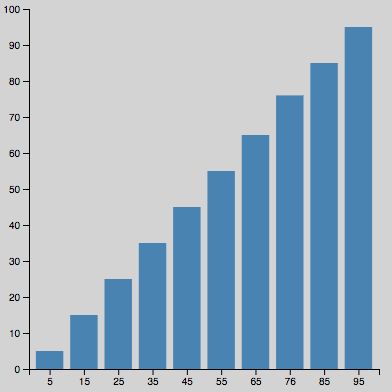
What we've actually created with that markup is a viewport that is 400 pixels wide and 400 pixels tall. Sara says:
The viewport is the viewing area where the SVG will be visible. You can think of the viewport as a window through which you can see a particular scene. The scene may be entirely or partially visible through that window.
...
You specify the size of the viewport using the
widthandheightattributes on the outermost<svg>element.
An important point from the quote above is that the viewport determines how many pixels are visible. Even if the scene is bigger than 400 by 400, that is all we're going to be able to see.
Now what about viewBox? Well, you can think of the viewBox as a region of the SVG that will be snapshotted and then scaled to fill the viewport. For example, given our 400 by 400 SVG above, what if we specified a viewBox half that size?
<svg width="400" height="400" viewBox="0 0 200 200"></svg>Would you be surprised to know the chart above now looks like this? What happened?
What happened first is that the chart was drawn at 400 x 400 like normal. Then, the SVG was cropped to the 200 x 200 viewBox at the top left and that region was scaled up to fill the 400 x 400 viewport. The result is that we only see the top left quadrant of our chart, which is mostly dead space.
What happens if we take the opposite approach and make the viewBox twice as big as the viewport?
<svg width="400" height="400" viewBox="0 0 800 800"></svg>That's right, the chart will essentially be shrunk down, because the chart was drawn at 400 x 400 but then the 800 x 800 viewBox had to be scaled down to fit the viewport.

This can definitely be a mind bender at first, but reading Sara's article and playing with the code should help it sink in. Or you can pretty safely ignore the intricacies and just let responsivefy work its magic!
Whew, that was a long tip. Happy Hacking!